Eye on Nature Magazine Spread
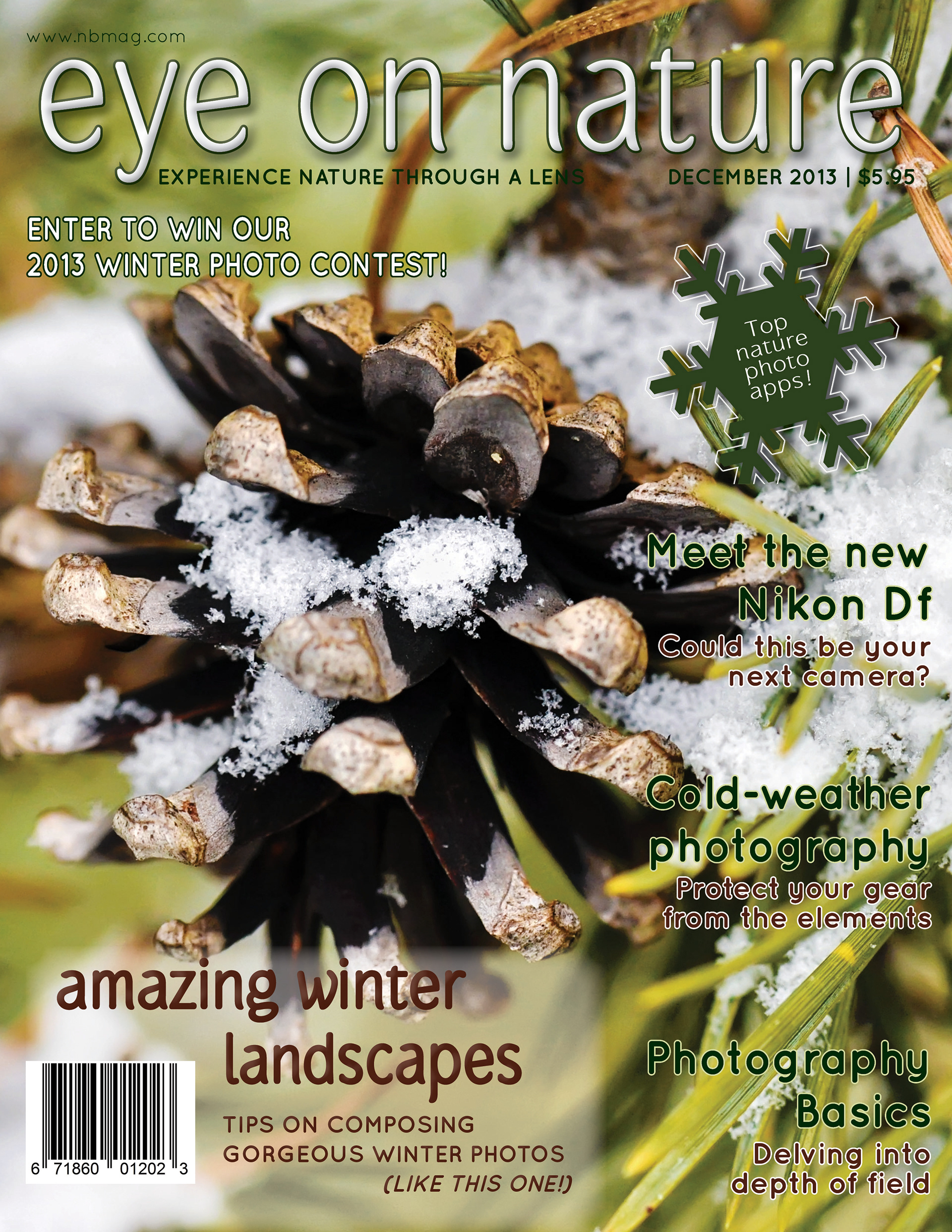
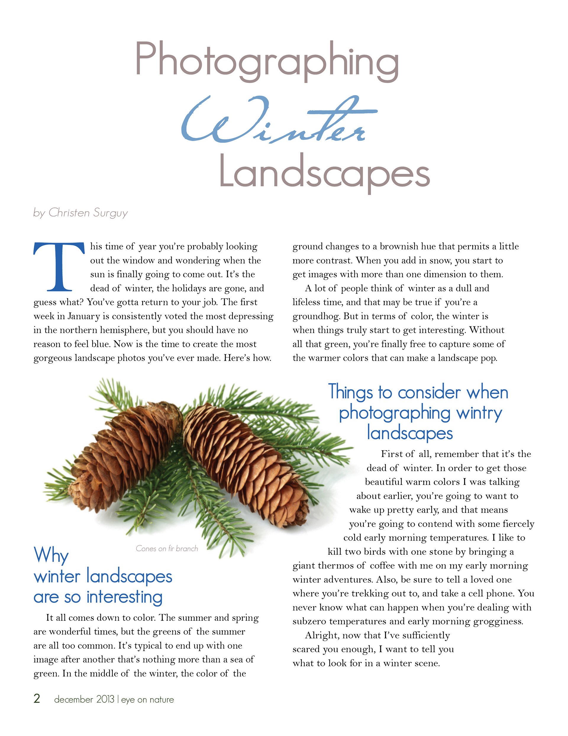
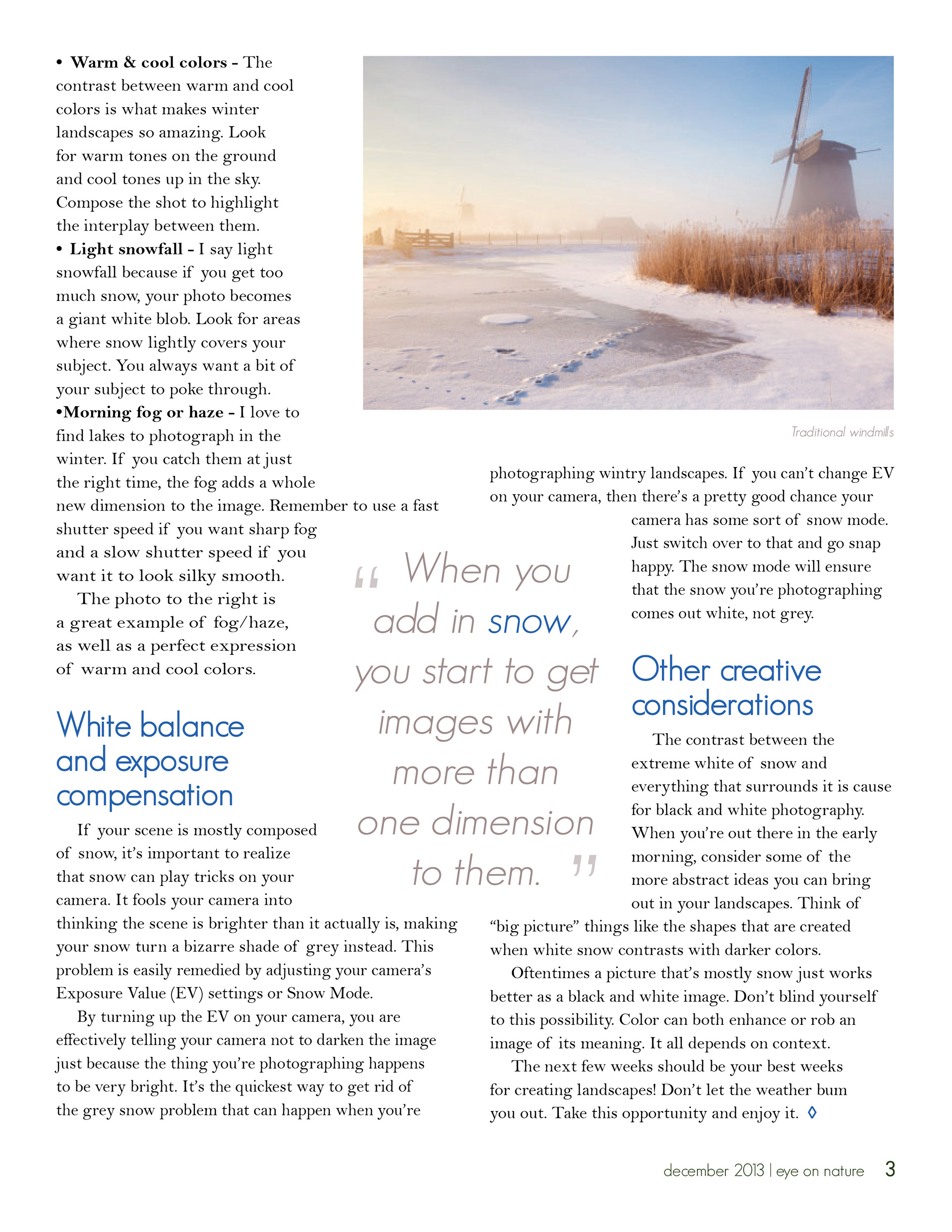
Eye on Nature is a fabricated magazine whose target audience consists of individuals who enjoy photographing all aspects of nature. I used Adobe InDesign CC to create the cover and inside spread with the exception of using Adobe Photoshop CC to change the color of the stock images used in the design. I extracted my font colors from these images. Font colors on the cover depict green and brown earth tones, while the inside spread includes cool blue and gray hues consistent with the subject matter of the article – winter. I think the cursive “Close to You” font in which the word “Winter” is typed offers a wispy and wintry feel as well. While bright colors and a busy layout work for some magazines, I feel a more balanced and comforting style best suits this design.
CMST 310: Fundamentals of Electronic Publishing (2013) | Adobe InDesign
Eye on Nature Magazine Cover
Eye on Nature magazine targets audiences of nature photography hobbyists and backyard gardeners alike. To create the cover, I used a photograph of spring crocuses that I captured with my Nikon D90 camera. In Adobe Photoshop, a layer mask was added and the Grass Brush tool was used to hide parts of the letter shapes in the title as a complement to the nature theme of the magazine. The rest of the design attributes were created through the implementation of various tools and adjustment layers in Photoshop in order to demonstrate both my proficiency in the program and my application of design principles.
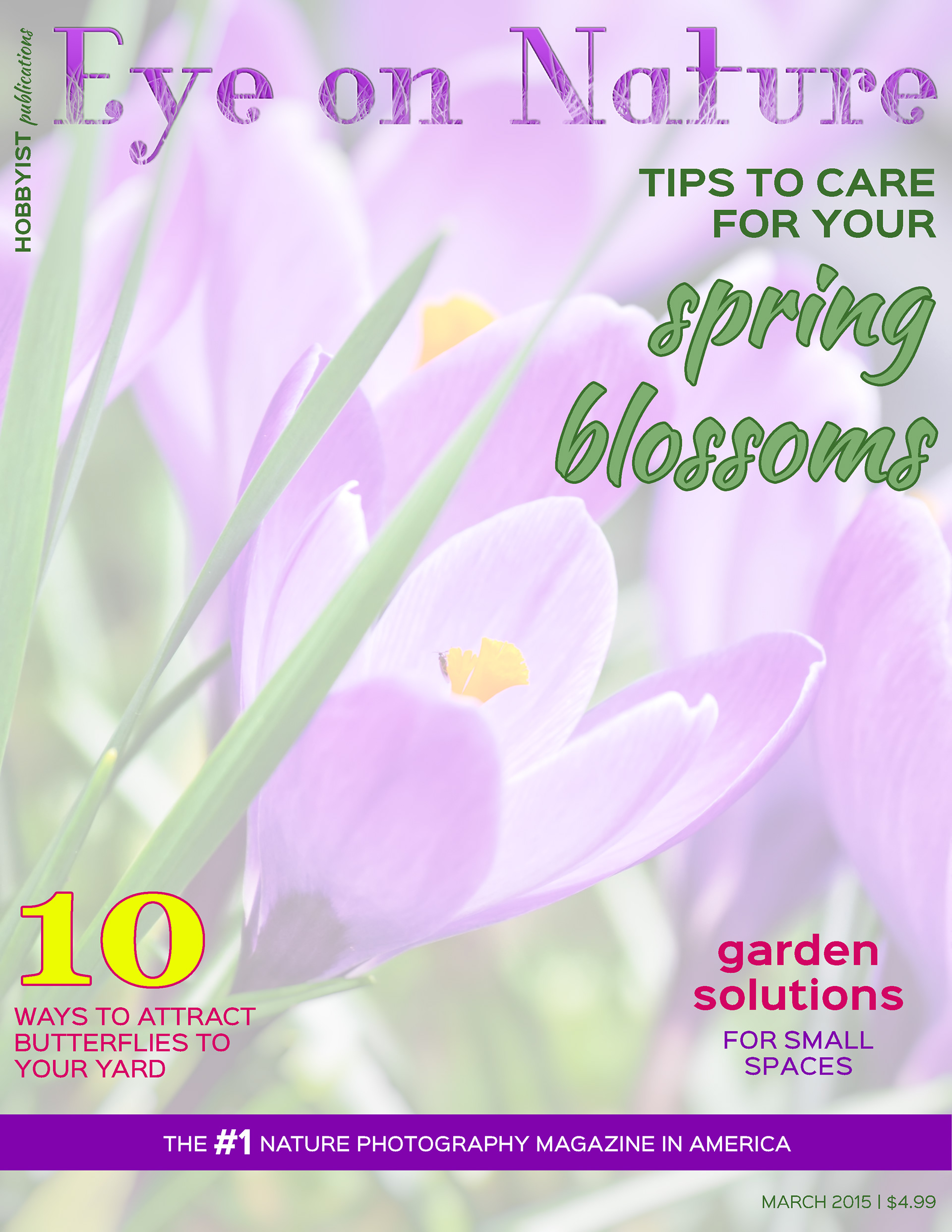
CMST 325: Image Editing (2015) | Adobe Photoshop
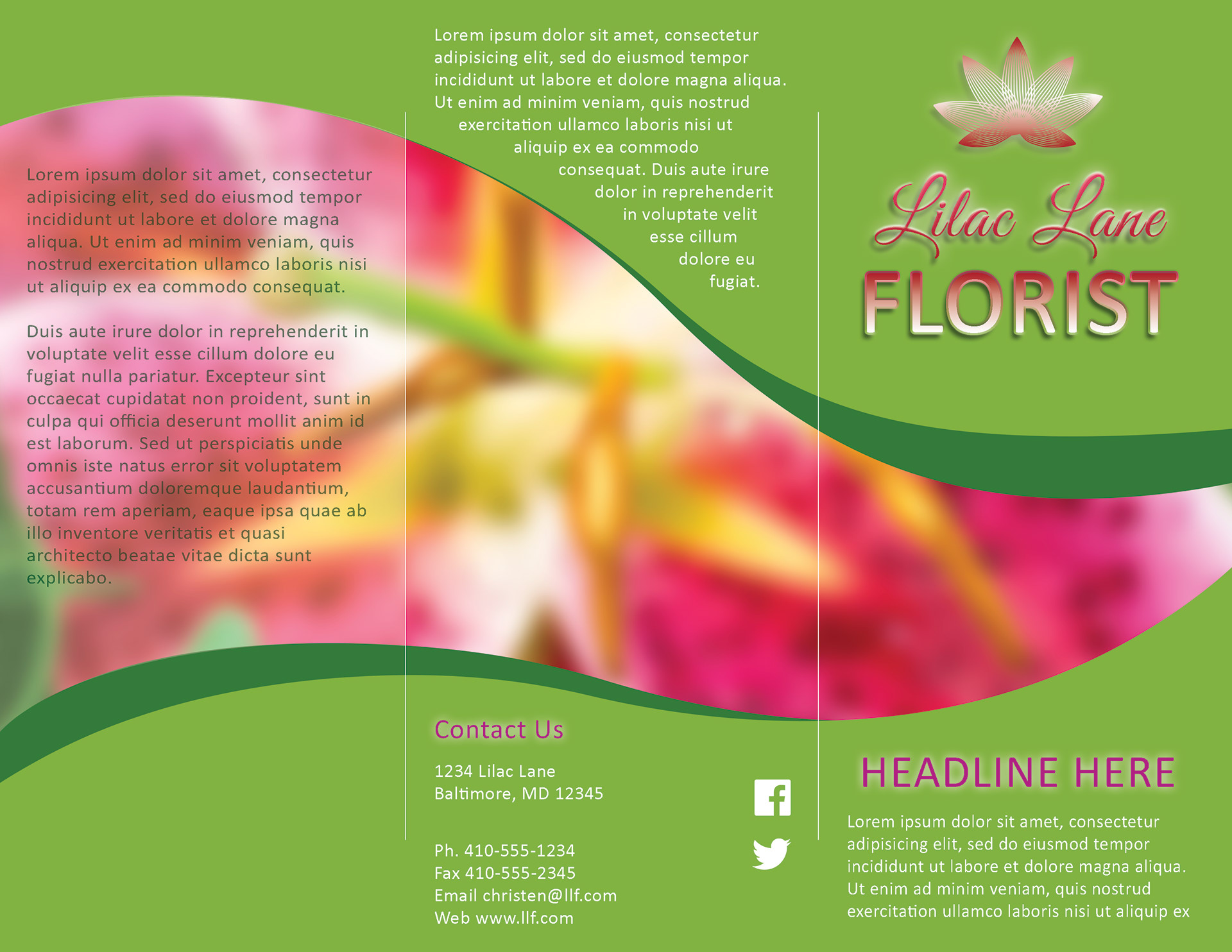
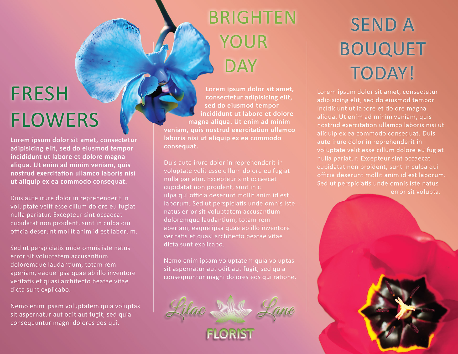
Florist Brochure
The purpose of this assignment was to create a tri-fold brochure, inside and outside, to advertise the products or services for a specific type of business in Adobe Photoshop. This project emphasizes design theory and technique through digital image editing using filters, adjustment and effects layers, fills, strokes, gradients, shapes created with the pen tool, text layers, and other advanced methods and elements. The color scheme displays good contrast and text is formatted well and easy to read. The logo and images are original and complementary to the theme of the floral design.
CMST 425: Advanced Image Editing (2015) | Adobe Photoshop
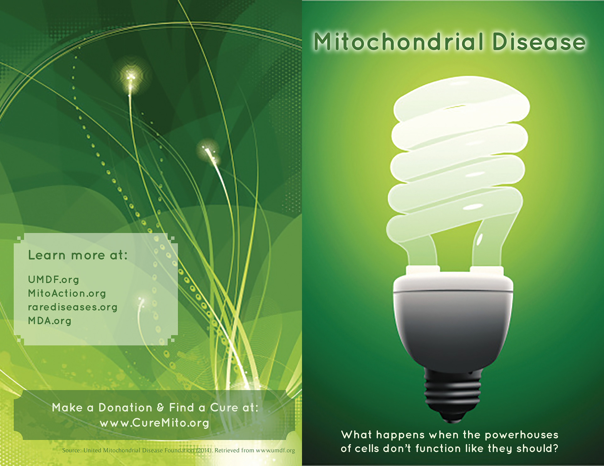
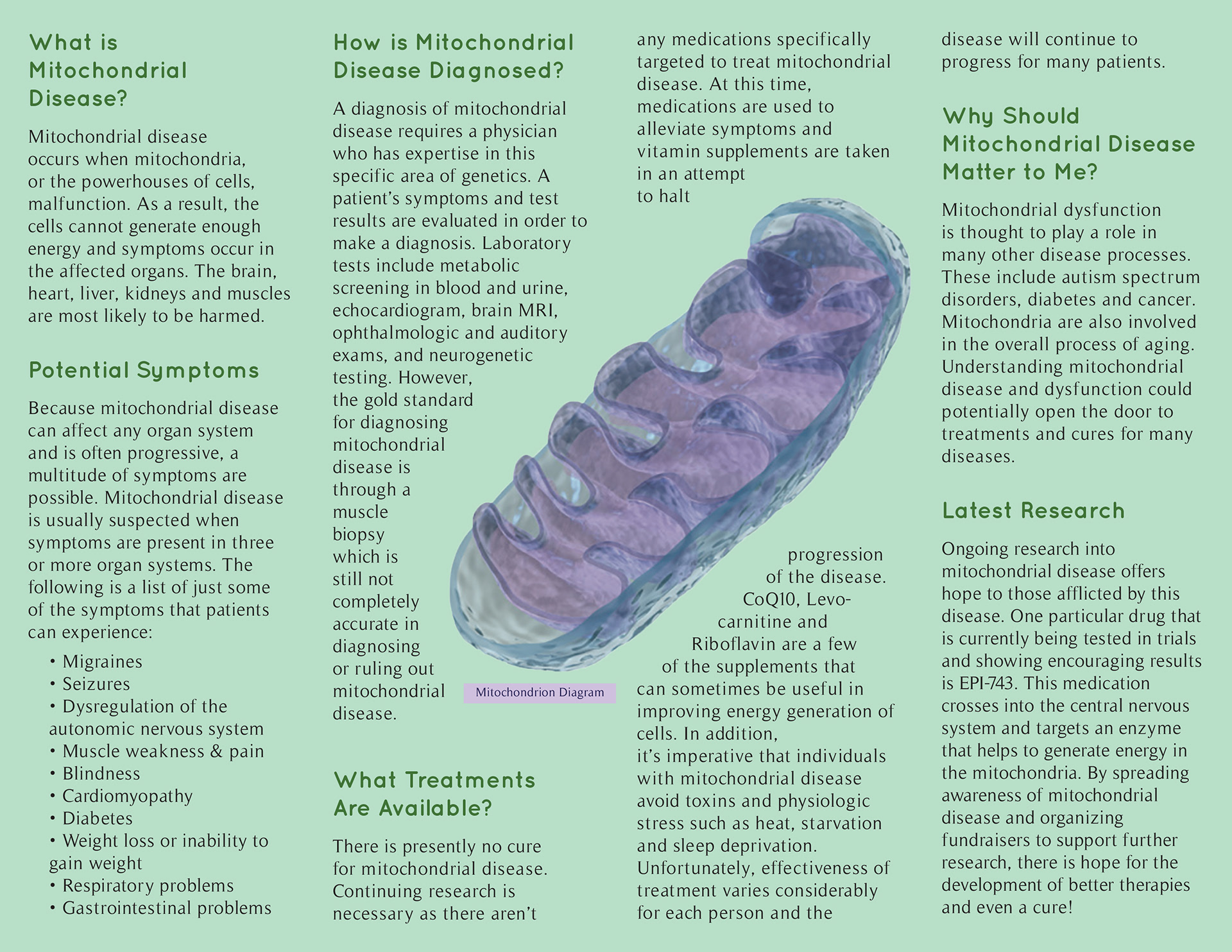
Mitochondrial Disease Awareness Brochure
The objective of this assignment was to develop the inside and outside of a print brochure in Adobe InDesign that educates people about what mitochondrial disease is, what treatments are available, and what research is currently underway to find a cure. This project emphasizes fundamental design principles through the employment of concepts, tools, processes and methods of advanced electronic publishing. The color scheme and images are visually appealing and functional to the theme of the brochure. The selected fonts "Quicksand" and "Timeless" are complementary to one another and establish readability and legibility.
CMST 311: Advanced Electronic Publishing (2014) | Adobe InDesign
Dragonfly Stationery
This assignment entailed the development of a business stationery kit for a type of business of the student's choosing in Adobe InDesign. Because I’m very passionate about photographing the natural world, I chose a nature photography business. My design communicates the theme of nature with a dragonfly logo. I chose tints of blue/purple for my design’s colors because I am fond of the blue dasher dragonfly. The males in this species of dragonfly are similar in color to that which I used in my design. I feel the cursive font I chose to design the name of my business depicts the wistful elegance associated with dragonflies. In completing this project, it was imperative to ensure that all elements (logo, business card, letterhead and mailing envelope) were unified in design.

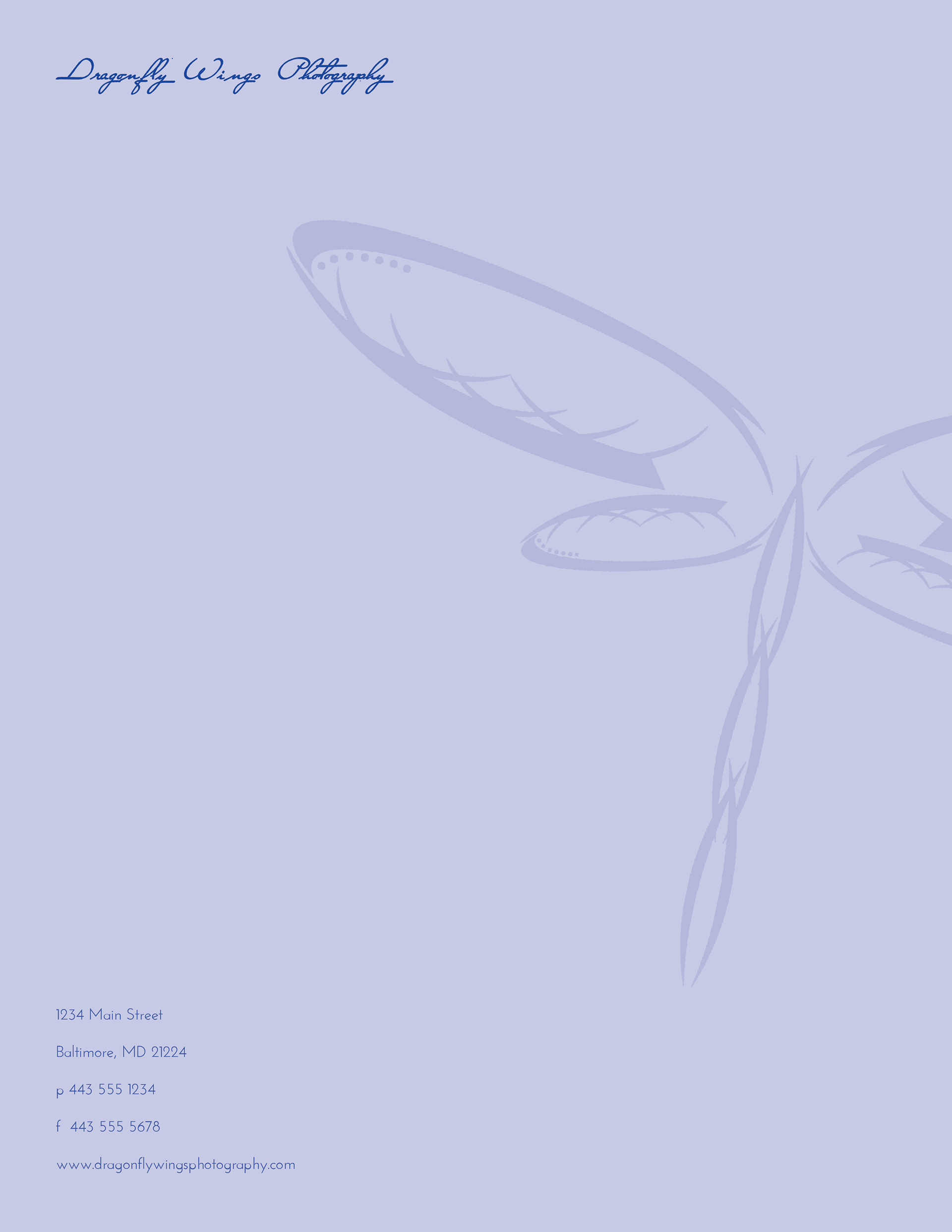

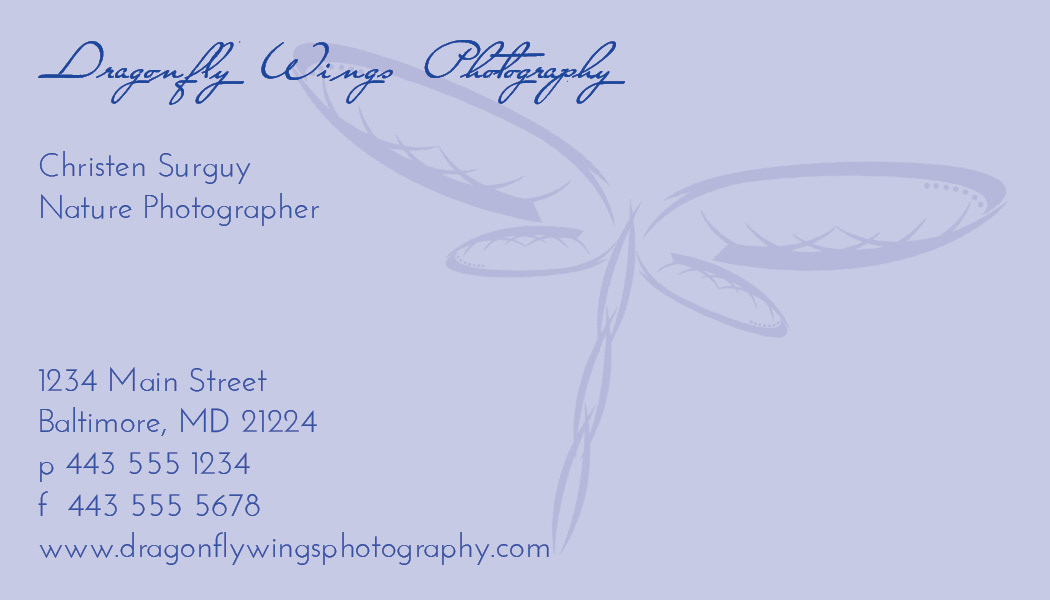
CMST 310: Fundamentals of Electronic Publishing (2013) | Adobe InDesign
IRE Stationery
Infinity Renewable Energy (IRE) is a fictional renewable energy company looking to expand its business and launch a marketing campaign to promote its new line of products. Designing company stationery in Adobe Illustrator is one vital part of the assignment. Letterhead, envelope and a business card featuring the company logo all help to establish the company's visual identity. The design is simple yet eye-catching to provoke a strong and positive impression. This business stationery depicts the company in a highly professional manner and communicates important contact information to prospective clients.


GRCO 350: Portfolio Development (2018) | Adobe Illustrator
IRE Logo
The fictional renewable energy company Infinity Renewable Energy (IRE) needs a logo that reflects the vision of the company. The successful illustration should communicate the expression of renewable energy, synonymous with clean energy, green living and earth friendly. I designed four variations of the company logo – a symbol, logo, a lettermark logo, a wordmark logo and a combination logo. In order to represent the clean energy of IRE, I decided on blue and green colors of the earth. The symbol logo embodies the infinite nature of the company's energy through its circle emblem.
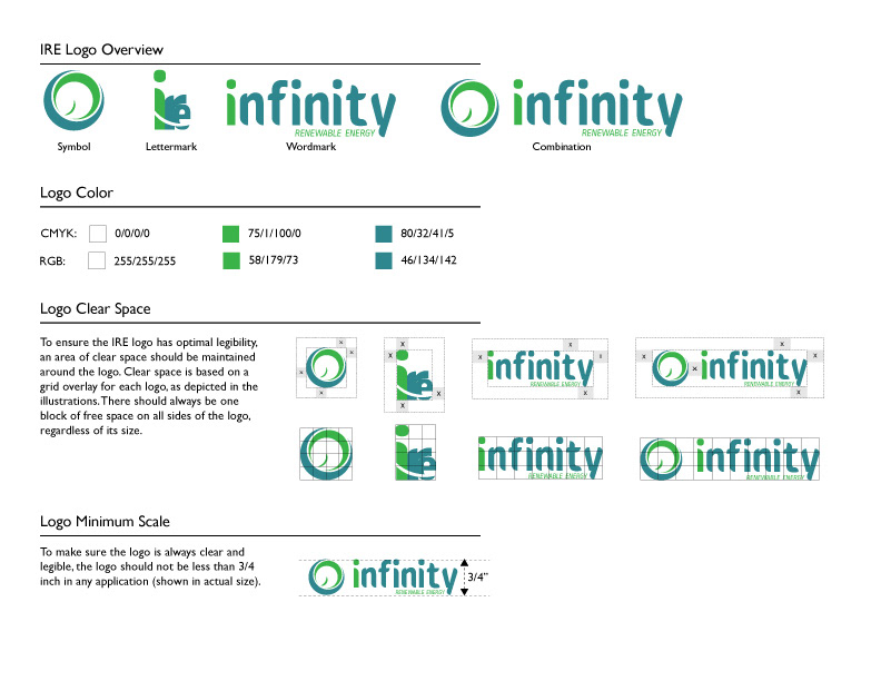
GRCO 350: Portfolio Development (2018) | Adobe Illustrator
Beach Party Flyer
For this assignment, I was instructed to design a poster advertising an event of my choice in Adobe Illustrator. The poster was required to include one to two original vector files, outlined fonts, fills, gradients and at least two special effects. I opted to design a poster promoting a summer beach party. The design is meant to communicate a fun and relaxed tone to coordinate with the event's theme. The sun, sand, flip-flop and "BrushSand" font which appears as writing in the sand all suit the poster's beach advertisement. The design elicits texture and depth through the sand's texture and the 3D effect of the flip-flop.
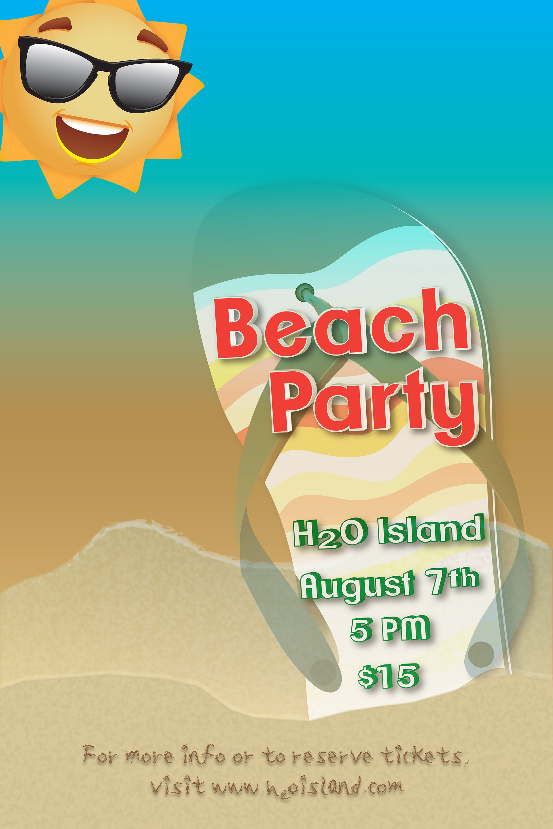
GRCO 100: Intro to Graphic Communication (2016) | Adobe Illustrator
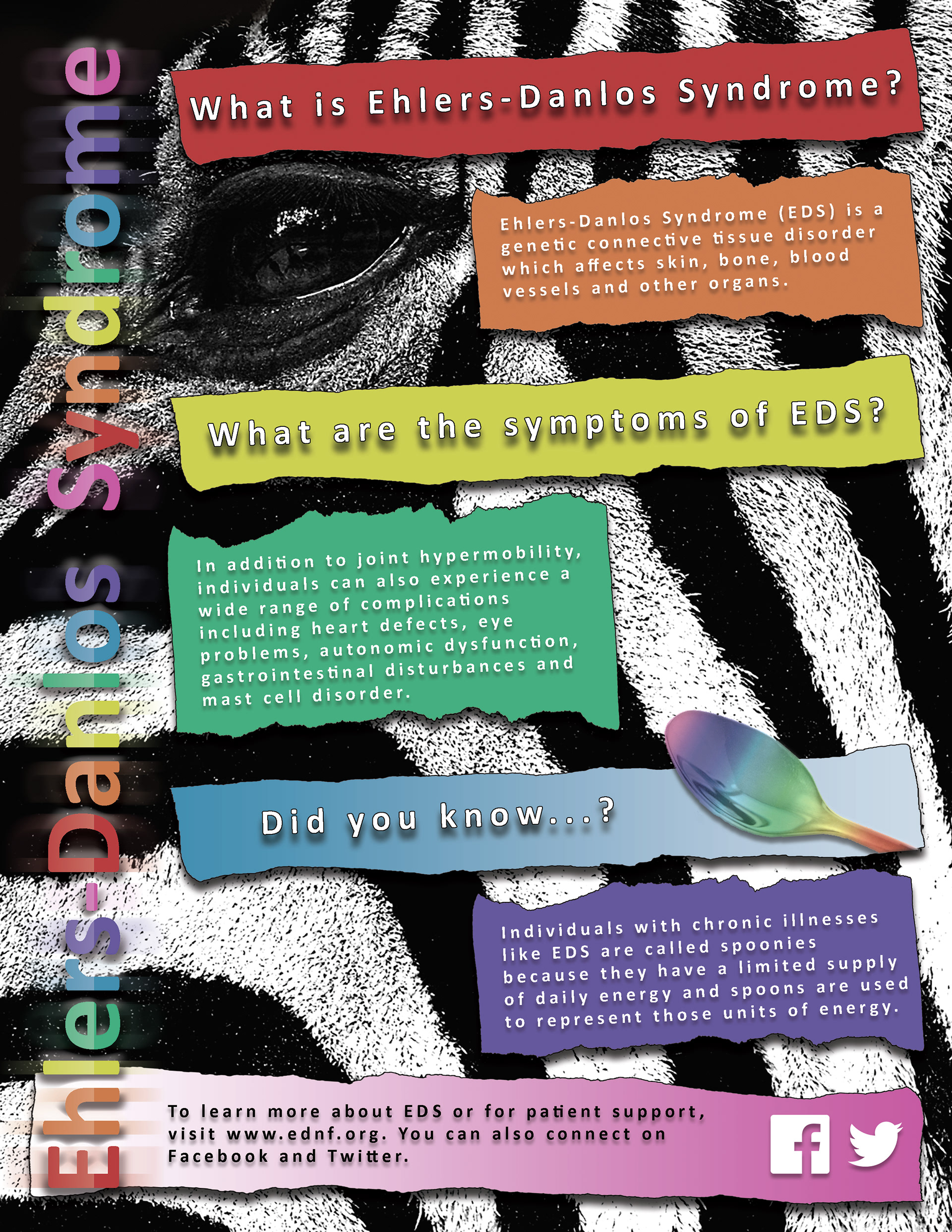
EDS Awareness Flyer
The purpose of this assignment was to create a professional advertisement in Adobe Photoshop which incorporated text elements, graphical elements, photographs and other design elements. I chose to design a print flyer for Ehlers-Danlos Syndrome (EDS) Awareness because my family is affected by this disease. What may be useful for understanding the concept behind my design is that EDS is a rare disease and is represented by zebra stripes. The black and white colors are contrasted by rainbow colors. The advertising piece consists of a stock photograph and new elements created within Photoshop such as text, fills, and drop shadows.
CMST 425: Advanced Image Editing (2015) | Adobe Photoshop